

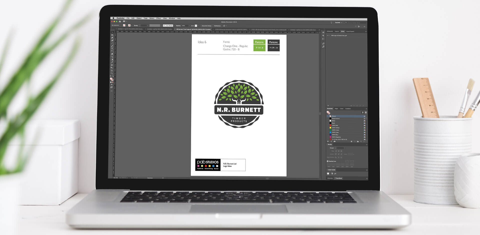
With new management in place, the company were looking to freshen up their long-standing logo to reflect the new direction they were taking.
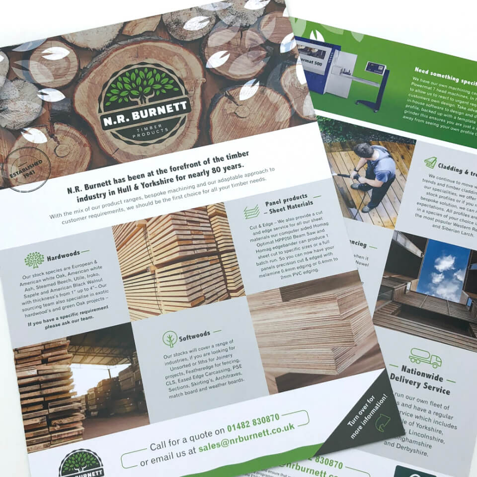
We developed a design which was clean and modern and which stands everywhere it goes; across letterheads, business cards, on top of invoices and throughout all internal documentation.
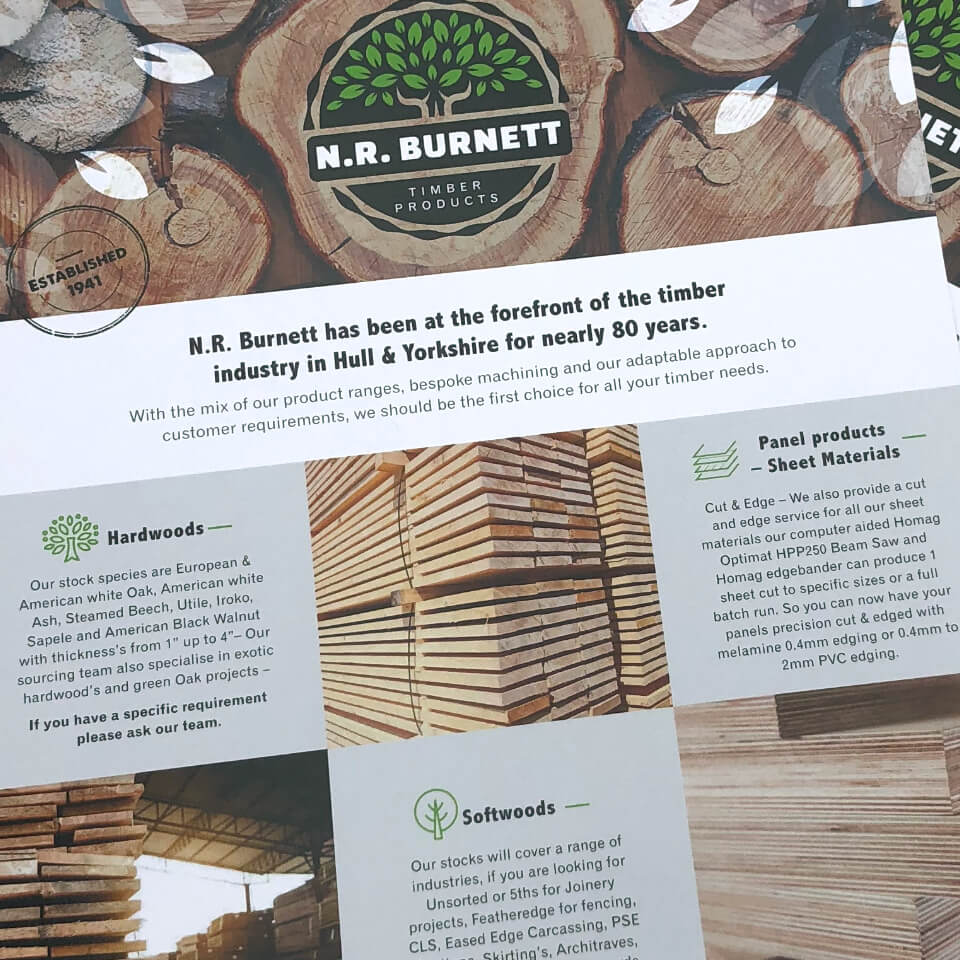
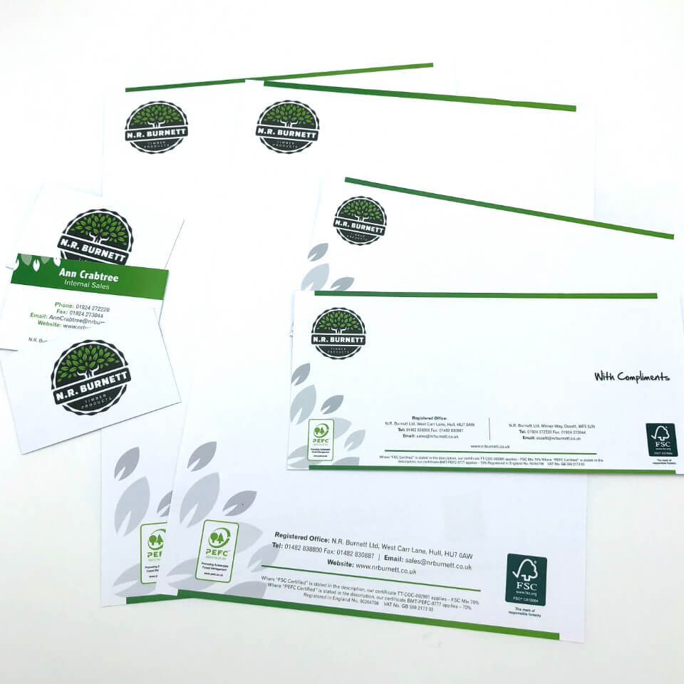
We’ve used the new brand guidelines on a range of printed materials used for promotional purposes.
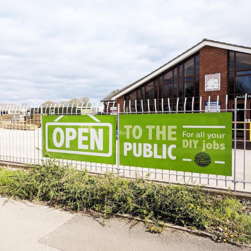
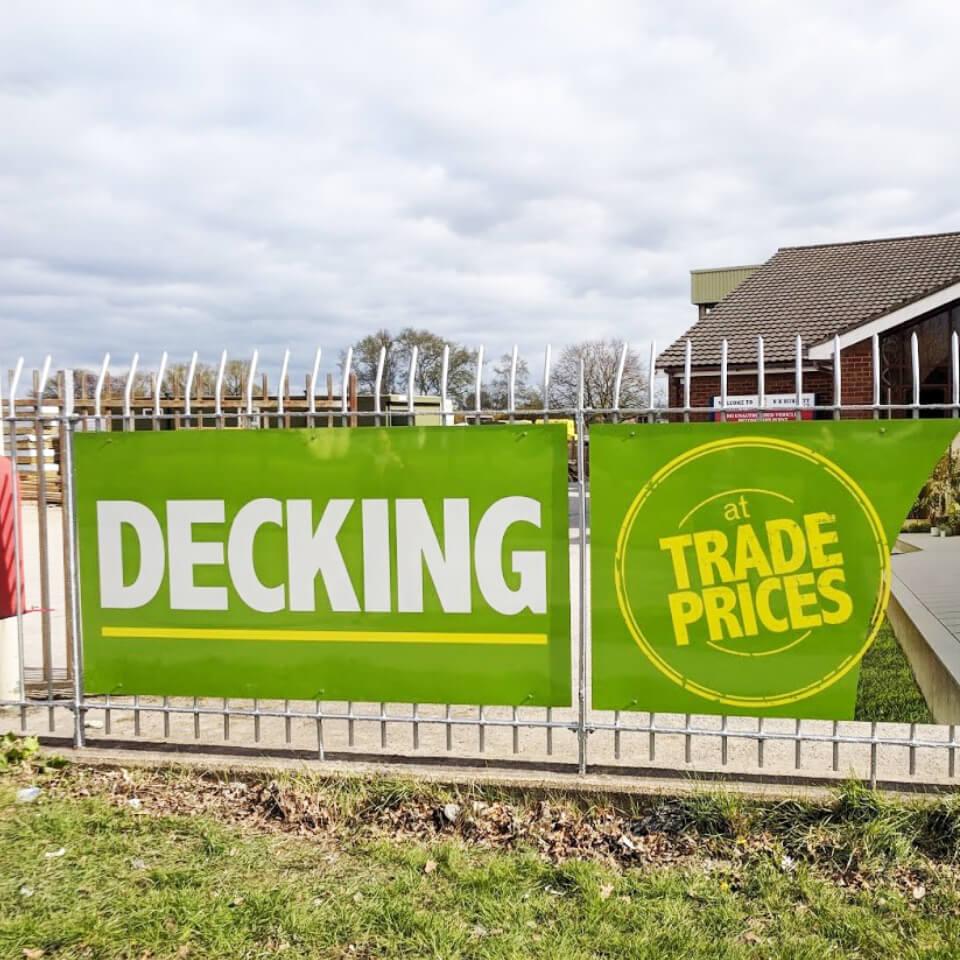
The NR Burnett site is big, and it’s surrounded by railings. That means there’s plenty of space to use for promoting products and services to anyone who might be passing by.
We produced some bold POS signage, showcasing the company’s products and letting people know exactly what goes on behind the railings.
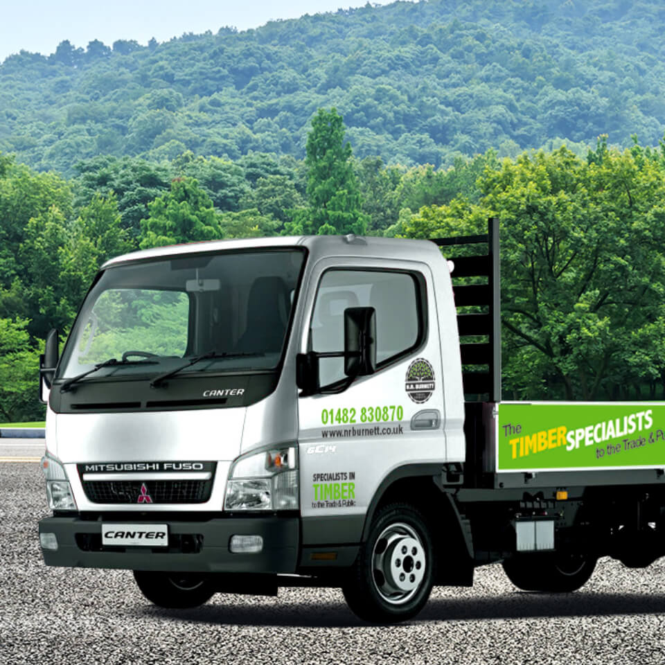
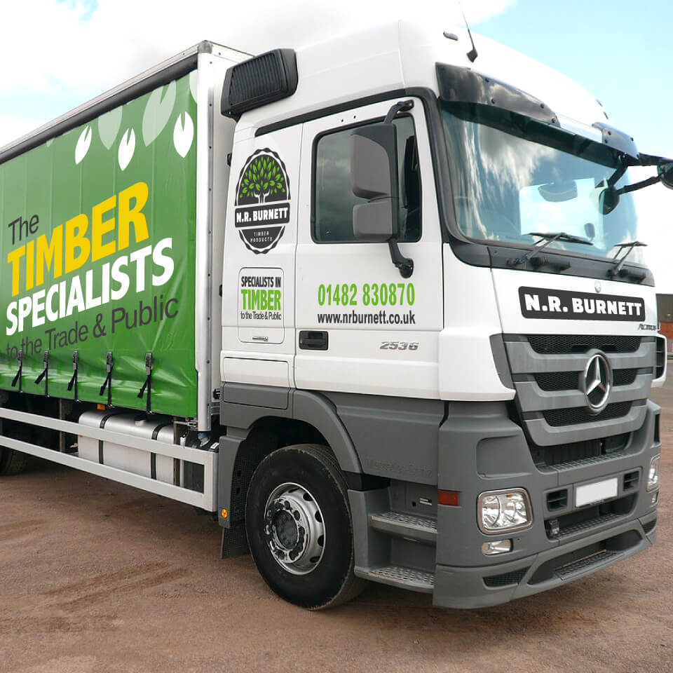
NR Burnett’s fleet of lorries were adorned with tired and dated graphics; we provided new artwork to bring the fleet in line with the sleek new branding.
“The greatest journeys begin by clicking a submit button.”
That’s what Chinese philosopher Lao Tzu might have said if he was around today.
Use the contact form to let us know what you’re looking for (the more details, the better) and we’ll put you in touch with the relevant team member.
We know most people prefer the faceless form, but we still like an old-school phone call every now and then. 01924 201711